3-d Foundations
(fall 2014)
assignment one - "The gift of life"
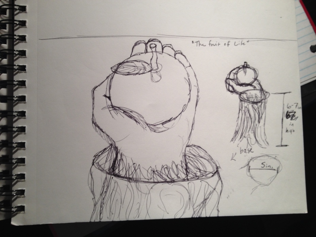
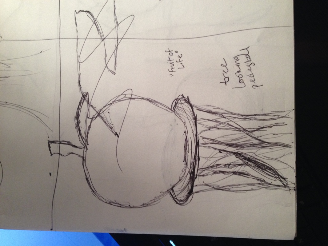
When approaching this project I wanted to use an object that directly related to my mom. She passed away suddenly over this past summer and I’ve been trying to encompass her spirit in all my pieces.
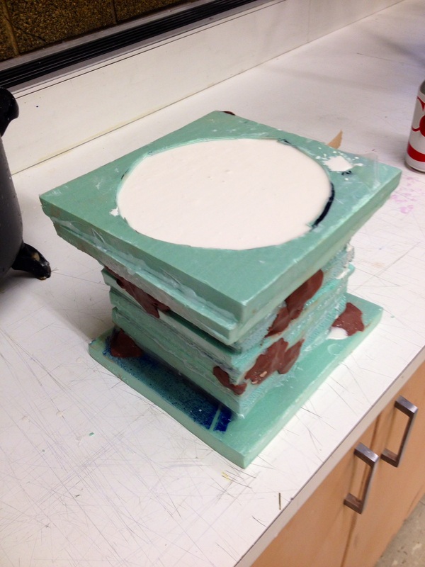
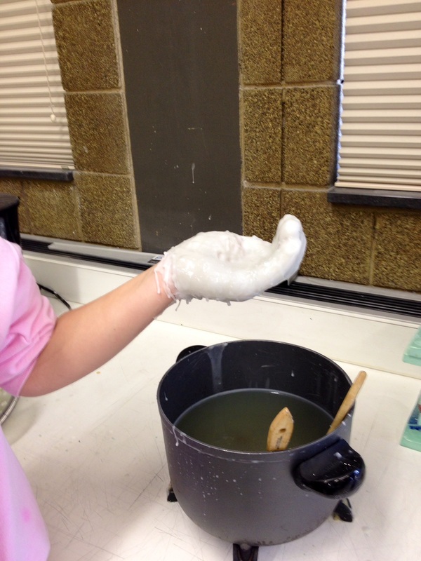
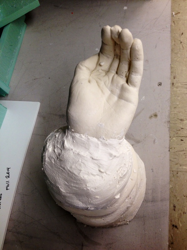
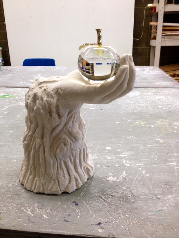
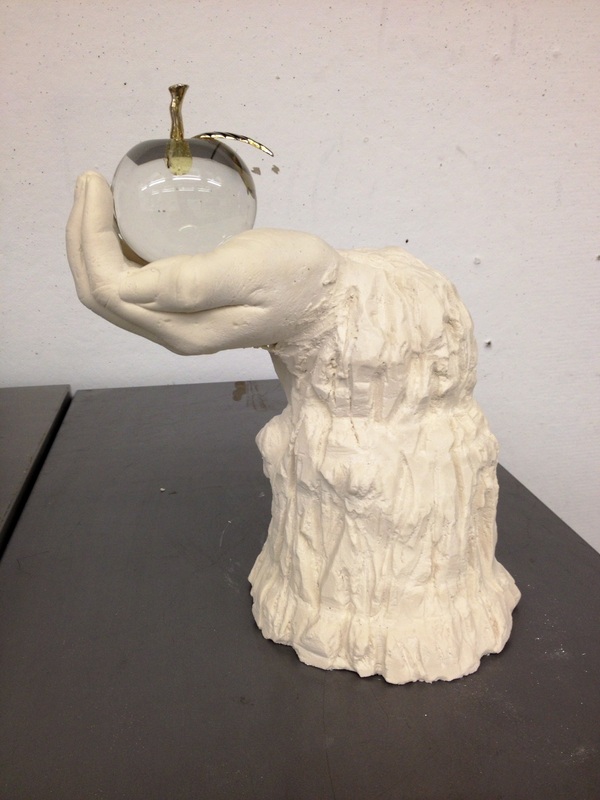
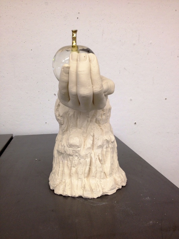
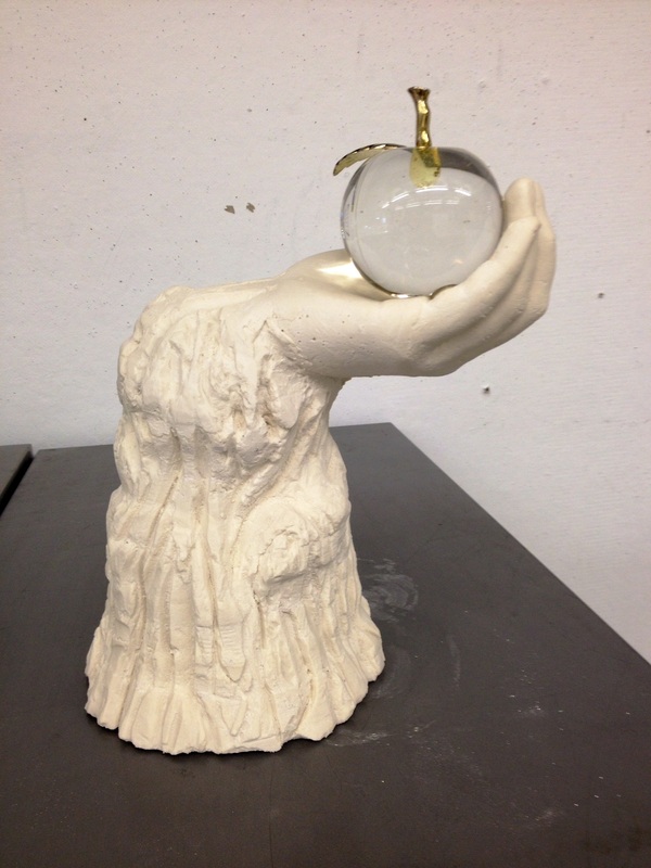
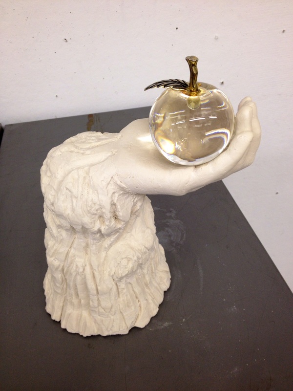
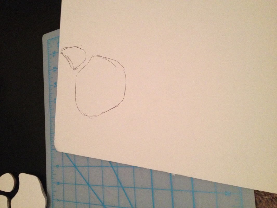
I ended up choosing a glass apple that belonged to my mom as my object to integrate into a sculpture. This apple has a beautiful shape and captures light in a unique way that I thought would work well with an all white plaster sculpture. The next step was to design my piece and come up with a concept as to why my piece would look the way it did. I ended up designing the apple to sit upon a tree pedestal that morphs into a hand which ultimately holds the apple in place. The concept behind this piece came rather easy to me. My mother was a woman of faith and one of the first bible lessons we are taught as a young child is the story of Adam and Eve. The apple officially started life as we know it. I decided to place the apple on a tree pedestal to not only promote its importance but to also represent life. Trees grow, they give up air to breath, and sometimes food to eat, thus giving us life. I then chose to have the hand holding the apple to show that it is a gift, it being life itself. Life is never promised, it’s a gift everyday to be alive and well. This however, is just how I view my piece. I leave my sculpture open to anyone’s own interpretation of how it makes them feel or perhaps what it makes them see.
I personally enjoyed the process of creating this piece and watching it come to life. I found my concept growing (no pun intended) the more I worked on it. I’m very happy with the outcome and I think I really captured what I had intended to based off of my own ideas and sketches.
Assignment two - "The Guardian "
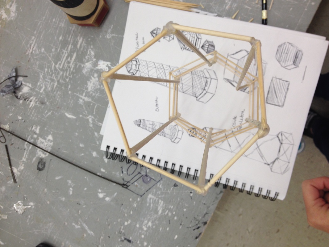
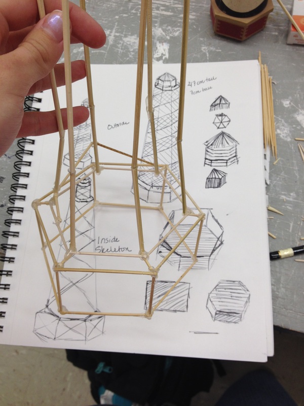
Finding an object for the “Design from Line” project was easy, I knew exactly what I wanted to do. However, achieving the piece I wanted to create was a different story. This project really made me think about how different structures can be made. The biggest thought that went through my head throughout this project was how to use different line widths to portray mass throughout my piece.
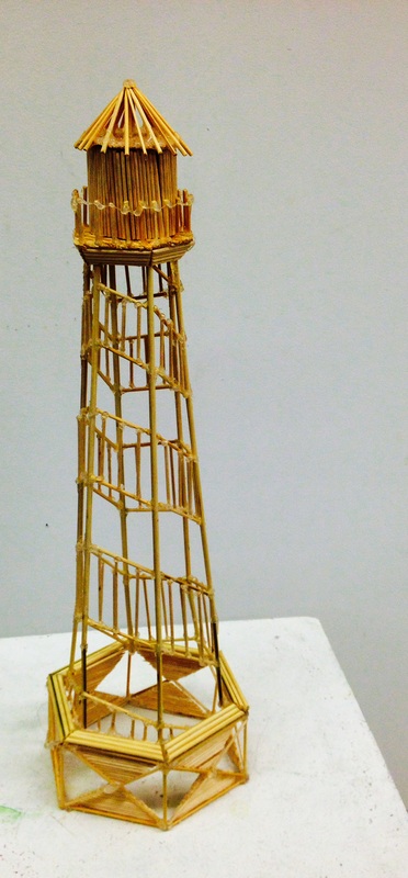
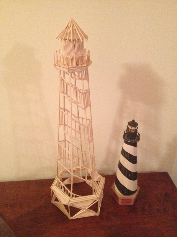
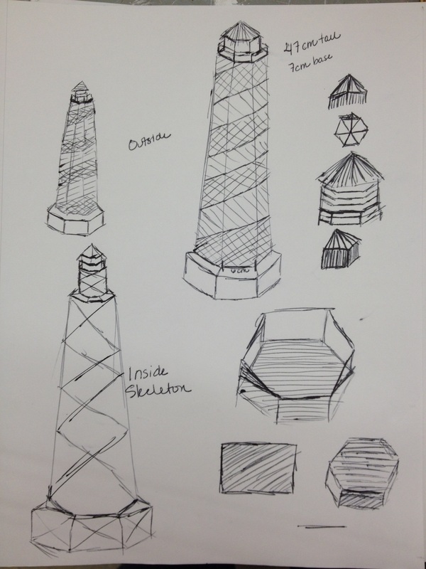
My piece is modeled after a small lighthouse that again was my mom’s. She loved lighthouses and I too think they encompass a sense of peace. For me, a lighthouse shows that your always have a guardian watching over you. Like my previous project, this project became more than just a simple project. This project became a new challenge of how I could use my mom as my muse and really create something more than just lines. I found myself constantly looking over the entire piece to see how it flowed as a whole. If one little section wasn’t right I definitely wasn’t afraid to pull out that section and recreate it to better fit the entire piece.
I envision this piece being a pedestal piece, but not any kind of pedestal. I have two types of pedestals in mind. One would be a narrow rectangular prism that is just wider than the piece itself and about as long as the piece is tall. It would mimic the shape of the piece as a whole. The other type of pedestal I could see this piece on is an organically shaped formation that is almost like an island with a bluff. This second pedestal would play off of where people most commonly find lighthouses; on higher ground over looking water. This piece is definitely something that would be a little lower than eye level since it is a little bit taller.
Overall, I enjoyed the challenge of this project and learning how to deal with different obstacles I ran into. I do like the final outcome of my piece, it has character.
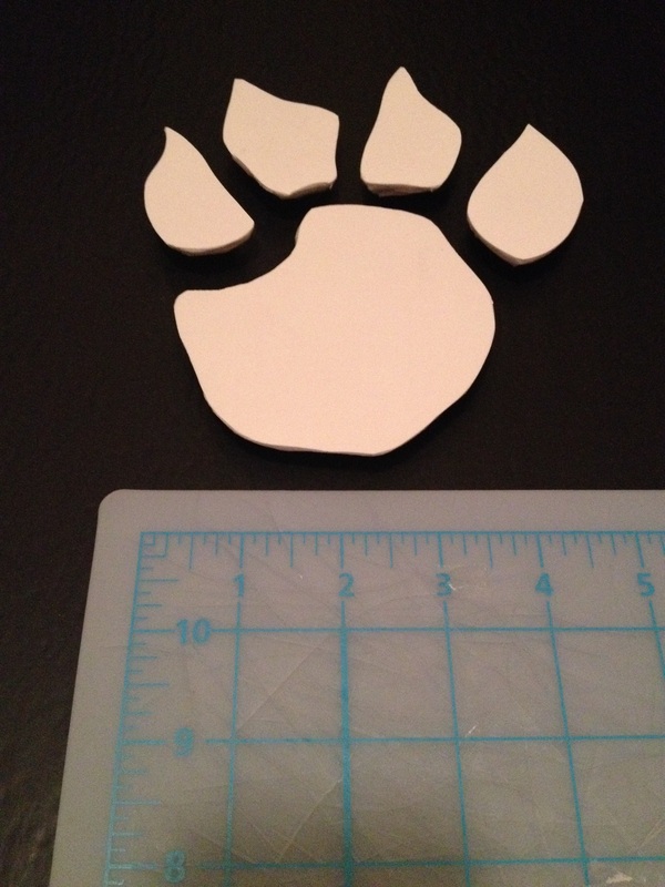
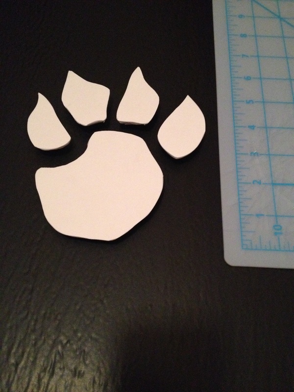
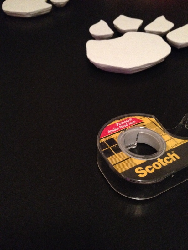
assignment three - "Husky paws"

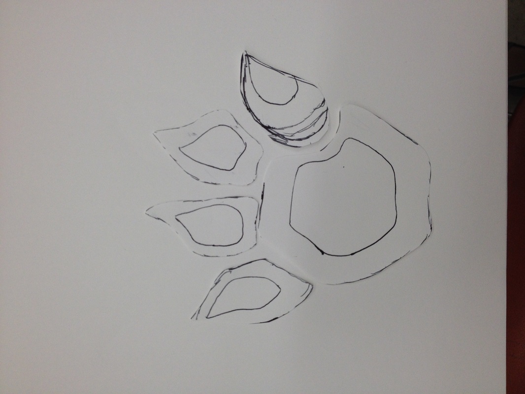
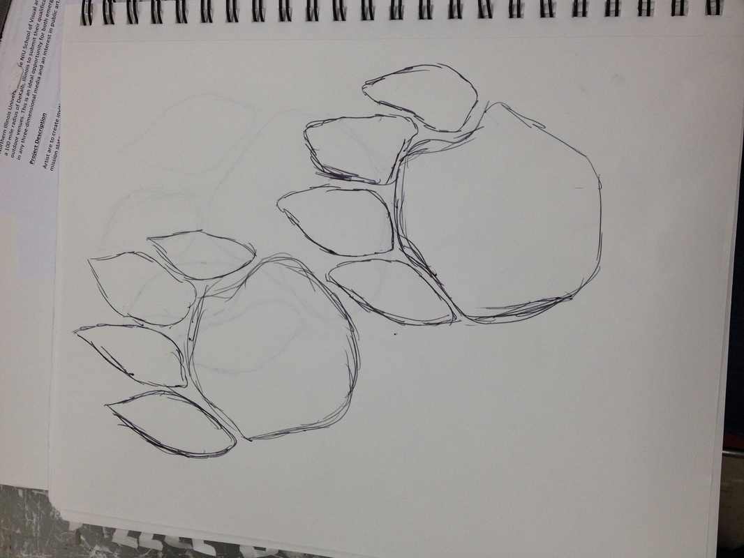
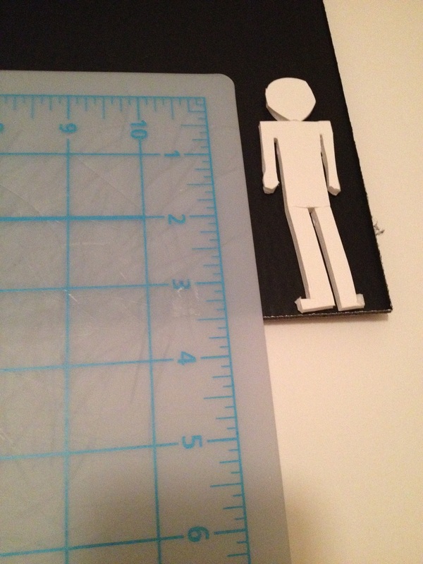
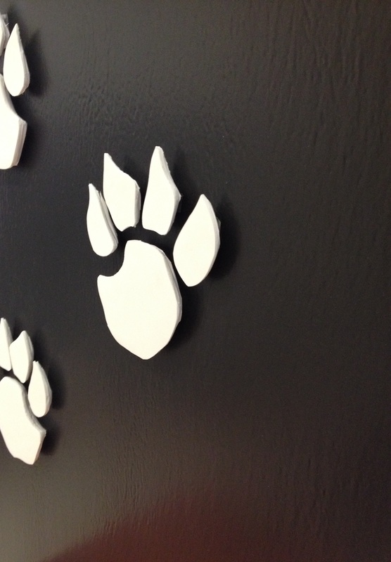
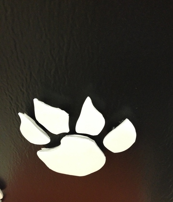
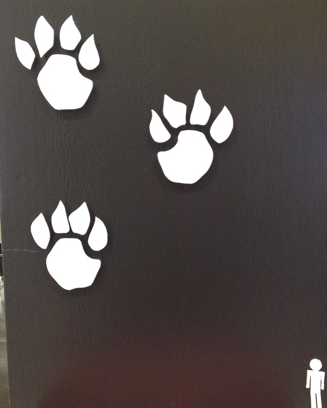
My area of interest for this piece is on the side of the music building, the wall closest to the art building. This wall is so sparse is any form of decoration and needs something to decorate it. The mascot for NIU is the husky, so honestly it would awesome to see more husky decoration across the campus.
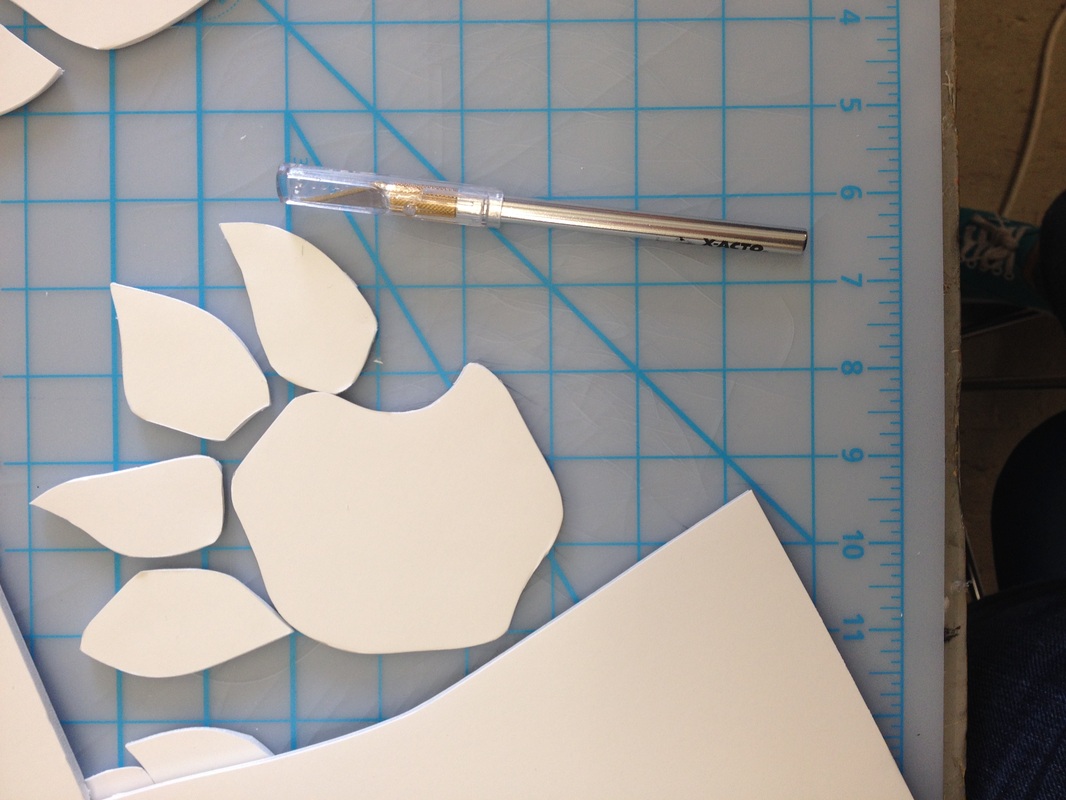
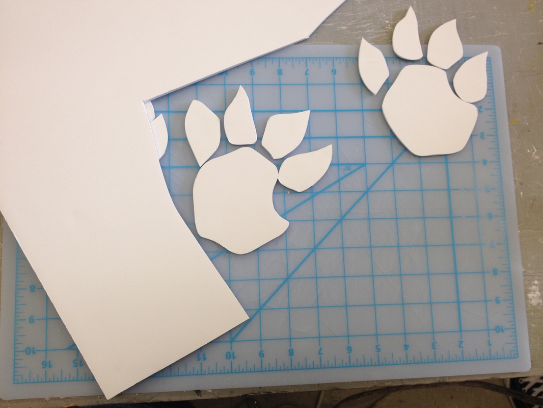
My idea is to have three large husky paws on the side of the building that look like a husky crawled up the side of the building. They would fit great here because of how bare the side of the building is. These husky paws would be roughly 9 to 10 feet tall, as modeled in the marquette. To give the wall pieces some dimension they would be rounded on the bottom moving then to a flat surface on the top. The idea of the husky paws directly ties in with the school mascot which isn’t showcased across the campus. My choice came down to the husky paw mainly because I didn’t want to do a typical sculpture that simply said “NIU” or something similar to that. There had to be a way to show school spirit without screaming NIU in the viewers face.
Ultimately I see the husky paws being made with an aluminum skin atop a sturdy skeleton frame on the inside. They would be welded together and rounded to give the paws dimension. The skeleton on the inside would allow for the paws to be hung without having fear of the piece breaking or morphing over time.
I would definitely love to see this piece actually get put into motion because there really is a lack of decoration on the side of that building. Not only is the side of the building lacking decoration but there aren’t very many sculptures related to the husky across campus. I’d love to have something that I’m truly passionate about be displayed on campus where most people are passionate about school spirit.
Assignment Four-Body ADORNMENT
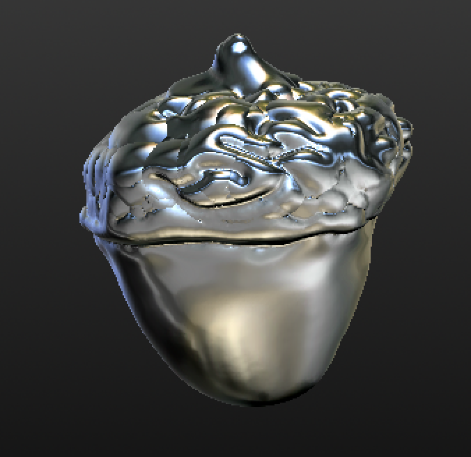
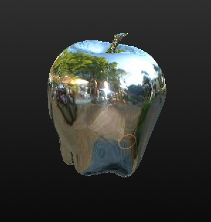
For the 3-d rendering project I decided that I would try my best to mimic certain things like an apple or an acorn to help me get used to using the programs. I found this project to be very interesting because you have to have everything just right to have it printed in 3-d form. Seeing how a 3-d printer works was incredible, but it does take forever. I was happy knowing that we are learning things that a lot of other people don't have a chance to learn because their schools don't even have a 3-d printer.
Assignment Five - Wooden toolbox
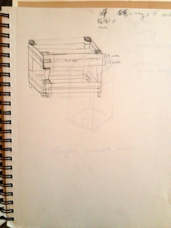
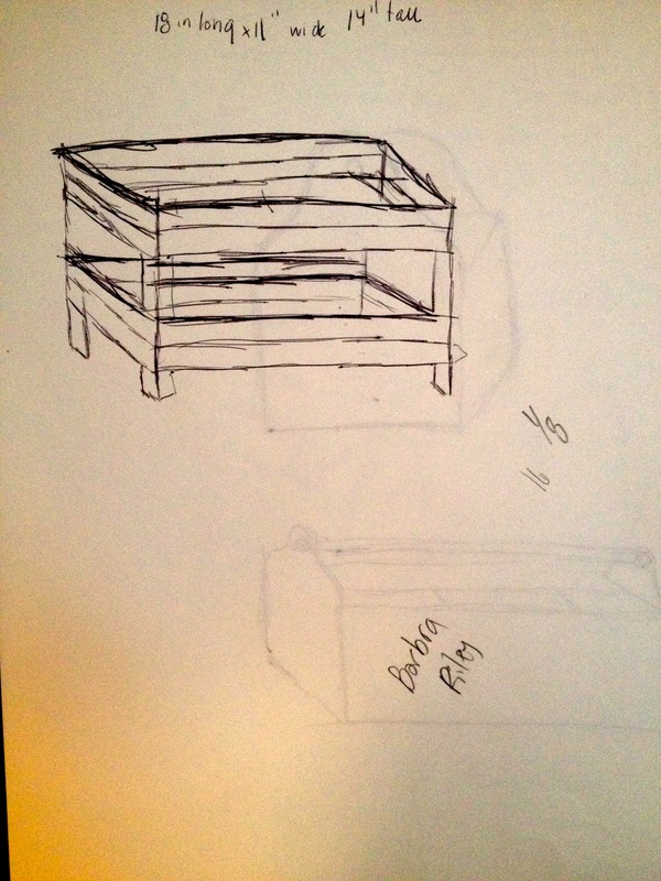
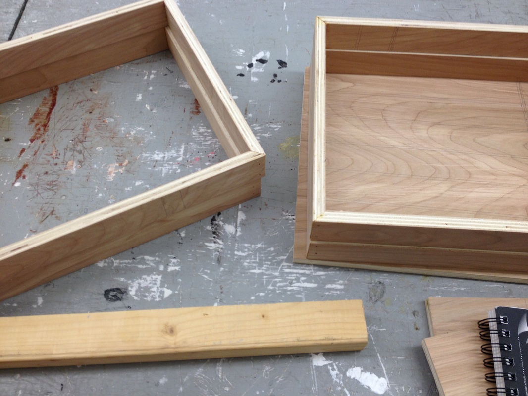
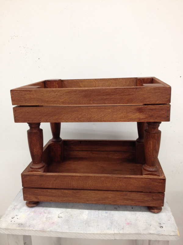
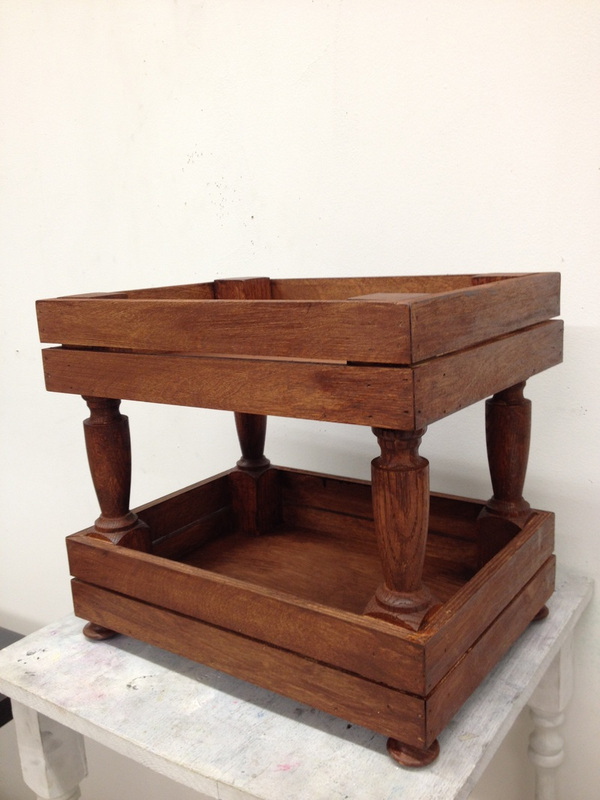
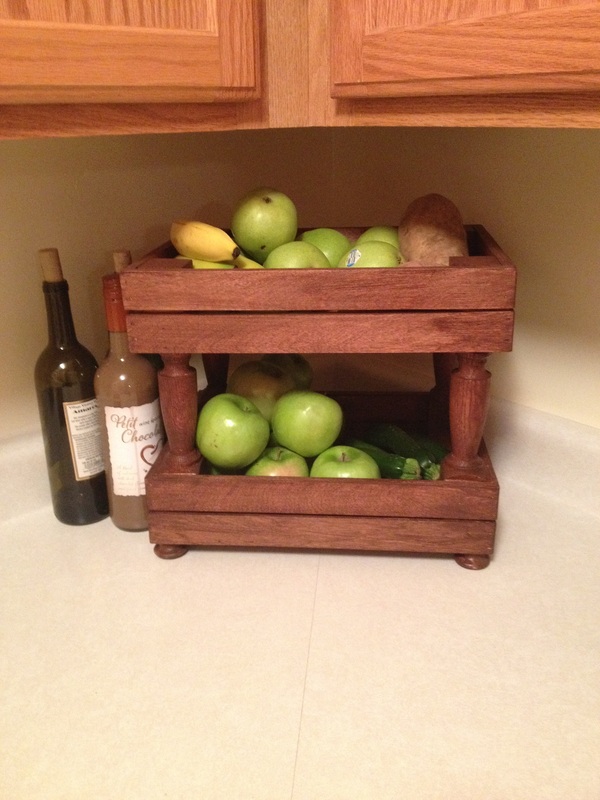
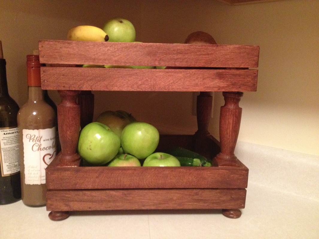
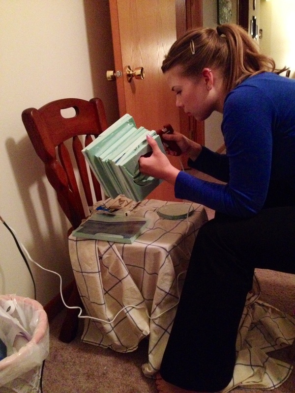
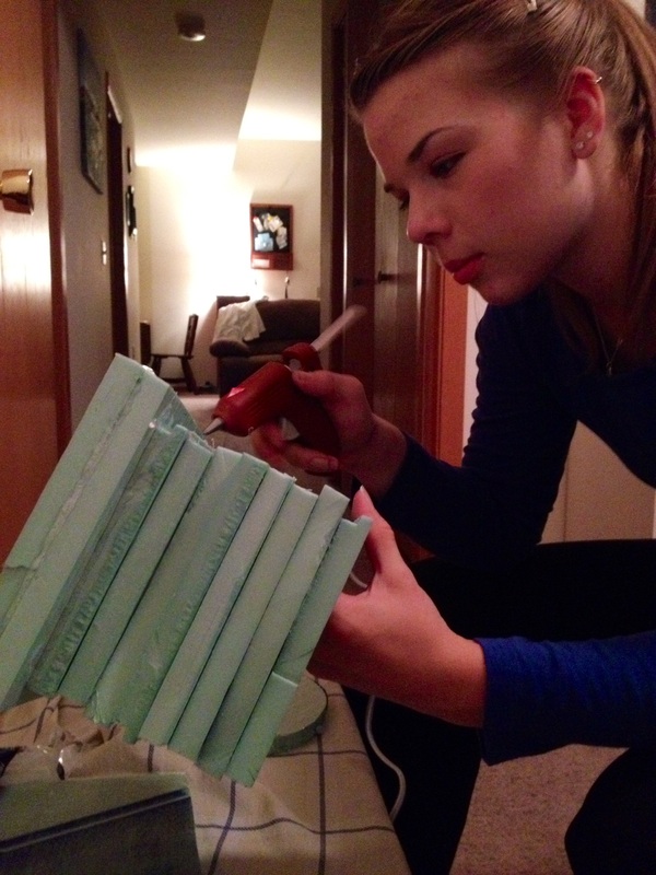
For my toolbox, I chose to make a box that holds fruits and vegetables. I believe that fruits and veggies are the tools for a healthy life and give you energy for every day life. I wanted to keep fruits on the top for easier access because I have an apple and a banana every single day. I usually have a lot of vegetables on hand as well so those I wanted to showcase in the bottom basket. I’m well aware of how functional my piece is, but I like the practicality of it because I didn’t want to waste my time making something I would end up throwing out. I have a decent amount of knowledge with woodworking and I feel that I can end up with a piece that is up to par.
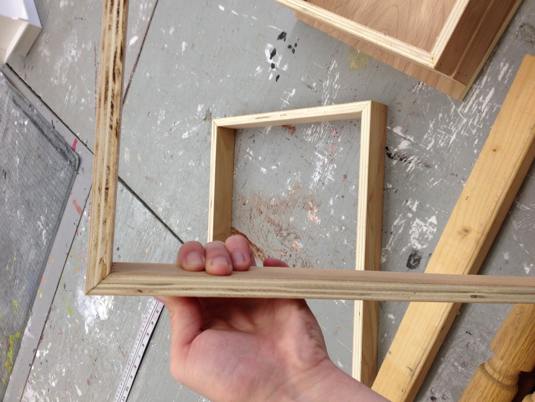
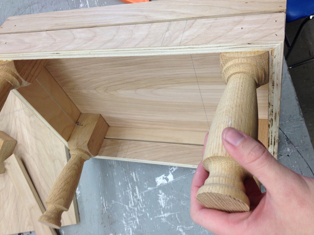
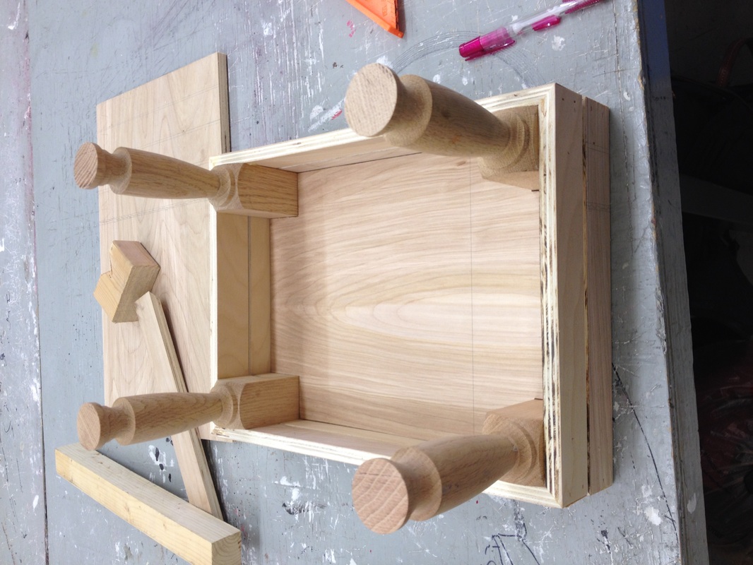
I chose to have the design look like a crate with gaps between the sides. The edges come together as a moitered corner for a sleeker, cleaner look to my piece. That was probably the most difficult aspect to my piece because I had to cut so many pieces of wood with a 45 degree angle and piece them together just right before nailing the together. After creating the shell of the box I started to piece together the legs and frame with the bottoms of each tier. I ran into very few problems in that step. I did, however, learn that drilling into a post of wood from the top can split the wood because its separating the grain. One of the legs on the piece cracked while drilling into it and I tried to hide it as well as I could.
I ultimately chose to stain my piece a dark walnut because of not only its beauty, but its strong look. I didn’t want my piece to just fit in and be unfinished and plain. I believe that a finished piece has color to it, when talking about wood that is. I think that the color I chose further enhances the look of my piece. I have a few elements I plan on adding to this piece when I take it home, including a hook for bananas but I haven’t found exactly what I’m looking for quite yet. I will say, I wish we could do more wood based projects, I enjoy them so much more.
Assignment six- Put a bird on it
Upon first watching this video all I could think was “how cliché.” Birds are literally on everything and all we think as a society is “oh, its so pretty it has a bird on it”. I found this project to be easy and difficult at the same time. Easy, because you can literally do anything for this project. Difficult, because the possibilities are endless so where do you begin with something like that.
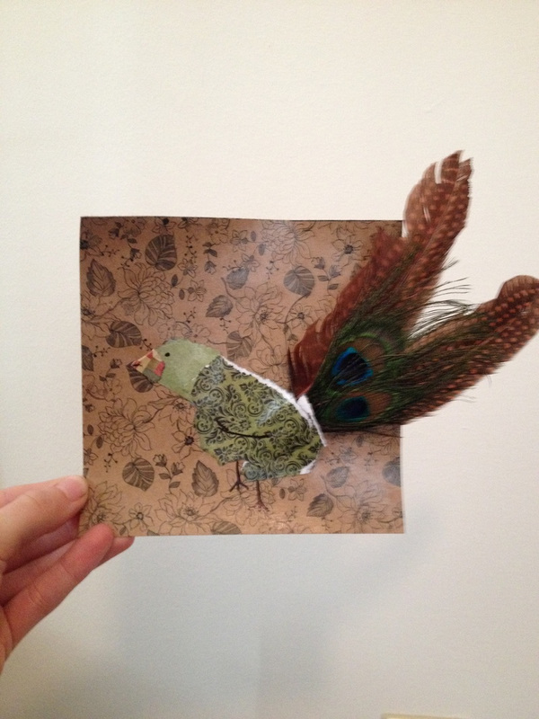
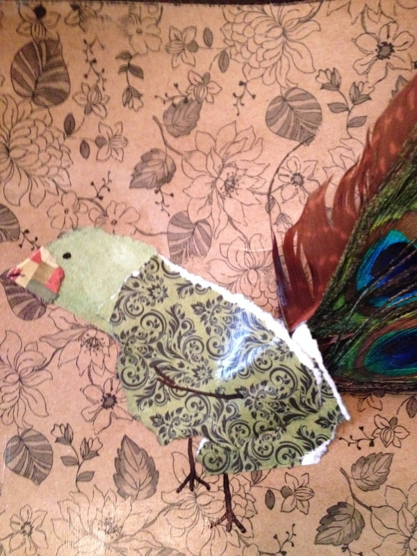
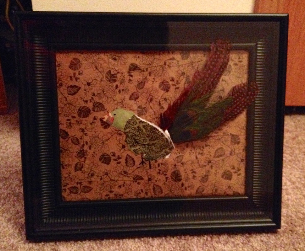
I decided to do a very small card stock ad feather bird with the background being a piece of card stock decorated with flowers. If I’m going to make something cliché, there has to be flowers in it as well to boost the pretty factor. The feathers added a more tangible aspect to my piece instead on letting the entire piece be a flat, non dimensional project.
To answer the question of whether or not the ornamentation of an object adds to its tastefulness I’d like to say that it depends. Craft plays a huge role in whether or not something is tasteful. You can’t jack something up with decorations and have it look like crap only to expect people to think its tasteful. I think trends have a lot to do with clichés. Sometimes, designers and artists purposely design something that is full of clichés. The thing that makes it popular is how they approach making it, the craftsmanship. Right now, for example, anchors are a very popular thing, borderline cliché, but a lot of people have something adorned with an anchor because of the way it was designed.
Overall, I think this project was very interesting. It took me a while to decide what I really wanted to do and what I could do. When working with something cliché, you really have to be careful with how you approach the piece, otherwise it could end up looking terrible.
Classmate Interview
For this project we were asked to interview a classmate. My classmate was Michelle Corkery.
Some of the first questions I asked Michelle were about the “Put a Bird On it Project”, simply the questions we were to think about. She told me “When I first watched the video I was completely lost and confused. I had no idea how we were supposed to create an art project out of it, however, with more thinking and brain storming i finally figured out what my project would be. The video made me approach this assignment in an abstract way that I have used before. We did not have set guidelines and the project was very open ended. The materials that I chose were Sculpey clay and bird stickers. The clay does not directly relate to my approach on this assignment because I simply wanted to create a bird out of class. The stickers, however, do relate to the assignment because i literally covered a bird with birds.”
I also asked her to consider whether or not the ornamentation of an object contribute to how tasteful it is. She said yes and her reason being that the video obviously showed that when you slap a simple design on something it instantly becomes more appealing. This whole “Put a Bird on It” project was about clichés, Michelle feels that symbols that are often defined as cliché can still be used by designers as longs as they are done in such a way that helps the overall look of whatever the piece is.
Later I asked her more personal questions that I had thought of. Being in a few classes with Michelle I get to see her ideas come alive, so I asked her what motivates her and what her favorite theme is that continues through her work. Michelle replied, “There aren't any specific concepts that motivate my work. I simply like to draw what I feel like drawing or creating what i feel like creating. I enjoy drawing animals and people doing actions rather than at a stand still. “ She enjoys working in every medium whether it be charcoal, pencil drawing, wood, whatever but, she really enjoys painting. “I have always enjoyed painting because it is very permanent but I can still create layers if I wanted to change something. When we did the Toolbox project I decided to incorporate paint into it because I have not gotten to use it in such a long time and I figured it would make it look cooler.”
The last question I asked Michelle was simply why art? What about art is so special to you?
“Art is something that has been special to me ever since i could pick up a pencil. For as long as I can remember I was always that artsy kid in every single class I was in from elementary school all the way till now. Art is something that I excel at and I figured that since I am good at it then I should continue to use it for the rest of my life. It is also something that allows me to express myself and I can make others happy with it. “
Go check out some of her work now!
http://michellecorkery.weebly.com/
Final Assignment- Broken Truth
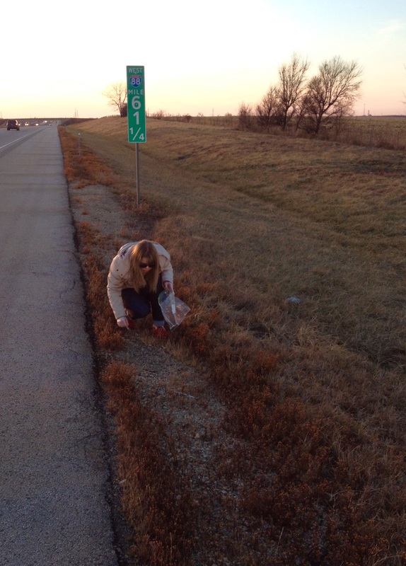
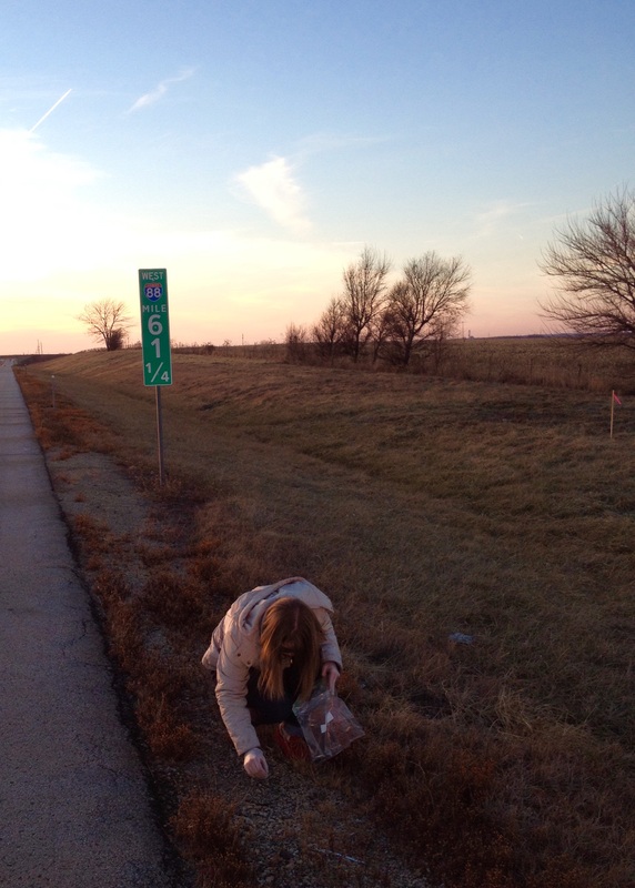
For my final project I had a hard time coming up with ideas that would actually mean something to not only me but others as well. All semester long I’ve been trying to connect every piece I make, in every class, to my late mother. This project was not different; it had to connect to my mom.
I set out on this seemingly impossible task with one idea in mind, get all my anger and frustration and all the scary thoughts I’ve had regarding my mom’s car accident out. The most important piece that I would make would regard directly to her accident. I pass the site of the accident quite frequently on I-88. Every single time I travel that direction I stop for a moment to look for remnants of the crash. My mom’s glasses have been missing since the day of the accident and I still have hope they are out there somewhere. The last time I visited the site I was faced with the upsetting truth that there was almost nothing left to show that there had been an accident. Somehow this showed me the dark reality that life goes on whether we like it or not.
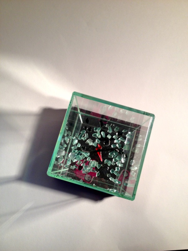
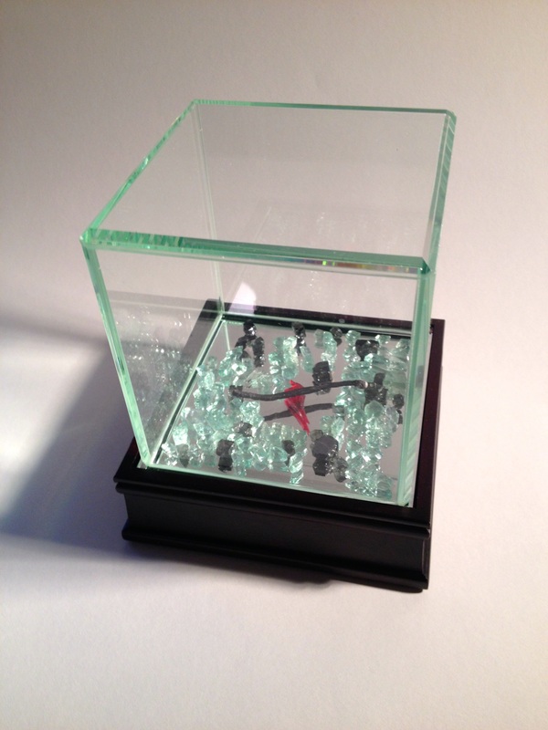
The one thing I picked up at my mom’s accident site was glass from the broken windows and windshield. I’ll never forget seeing the car for the first time a few days after my mom’s accident. I had never seen a car that looked worse. The doors barely opened, windows were blasted out, the windshield caved in, and everything in the car was ruined. Everything passed over me like a blur, I couldn’t even think while I was looking at that.
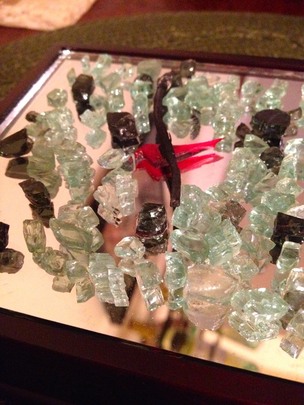
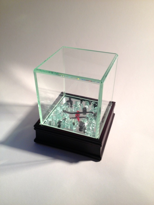
My piece is about my mother’s accident and the harsh reality that she is gone. The glass pieces represent the terrible way my mother died as well as how I feel, broken. With that, my mother was a religious person and so I am. For quite some time I’ve always connected fire or flames with life and religion. The burned match represents the lack of life, time is up and there’s nothing left. I ultimately decided to have there things in a glass case because though life moves on, I will never forget the eerie details or the terrifying things I saw in that week and this glass case keeps the broken truth pristine and encapsulated.
This piece was hard to work on because everything I think about was spilled right in front of me, the only thing missing was my mom. I ultimately plan to create other works regarding the accident. I’d love to use other things from my mom’s car that I kept to create a piece that represents the chaos of the crash, almost like an explosion. It’s hard to put my ideas for that piece on paper because its just so chaotic but I do think about what it was like for my mother a lot. I also plan to make a sculpture using medic gloves because that’s also one thing I won’t forget, the amount of medic gloves at the crash site shortly after it happened.
All in all, I am happy with my piece, it has a deeper meaning that what it appears to be. To me, art is all about deeper meanings.
I set out on this seemingly impossible task with one idea in mind, get all my anger and frustration and all the scary thoughts I’ve had regarding my mom’s car accident out. The most important piece that I would make would regard directly to her accident. I pass the site of the accident quite frequently on I-88. Every single time I travel that direction I stop for a moment to look for remnants of the crash. My mom’s glasses have been missing since the day of the accident and I still have hope they are out there somewhere. The last time I visited the site I was faced with the upsetting truth that there was almost nothing left to show that there had been an accident. Somehow this showed me the dark reality that life goes on whether we like it or not.
The one thing I picked up at my mom’s accident site was glass from the broken windows and windshield. I’ll never forget seeing the car for the first time a few days after my mom’s accident. I had never seen a car that looked worse. The doors barely opened, windows were blasted out, the windshield caved in, and everything in the car was ruined. Everything passed over me like a blur, I couldn’t even think while I was looking at that.
My piece is about my mother’s accident and the harsh reality that she is gone. The glass pieces represent the terrible way my mother died as well as how I feel, broken. With that, my mother was a religious person and so I am. For quite some time I’ve always connected fire or flames with life and religion. The burned match represents the lack of life, time is up and there’s nothing left. I ultimately decided to have there things in a glass case because though life moves on, I will never forget the eerie details or the terrifying things I saw in that week and this glass case keeps the broken truth pristine and encapsulated.
This piece was hard to work on because everything I think about was spilled right in front of me, the only thing missing was my mom. I ultimately plan to create other works regarding the accident. I’d love to use other things from my mom’s car that I kept to create a piece that represents the chaos of the crash, almost like an explosion. It’s hard to put my ideas for that piece on paper because its just so chaotic but I do think about what it was like for my mother a lot. I also plan to make a sculpture using medic gloves because that’s also one thing I won’t forget, the amount of medic gloves at the crash site shortly after it happened.
All in all, I am happy with my piece, it has a deeper meaning that what it appears to be. To me, art is all about deeper meanings.
